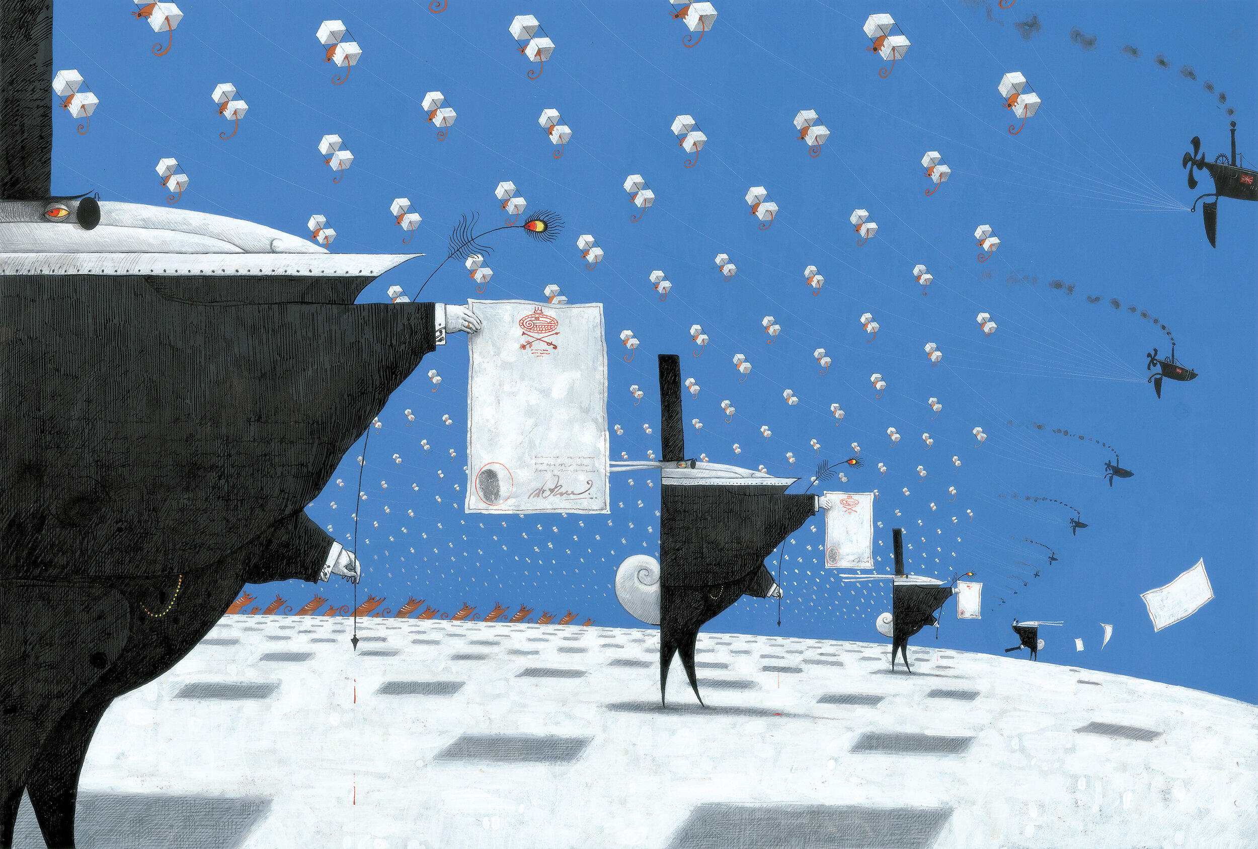
THE RABBITS
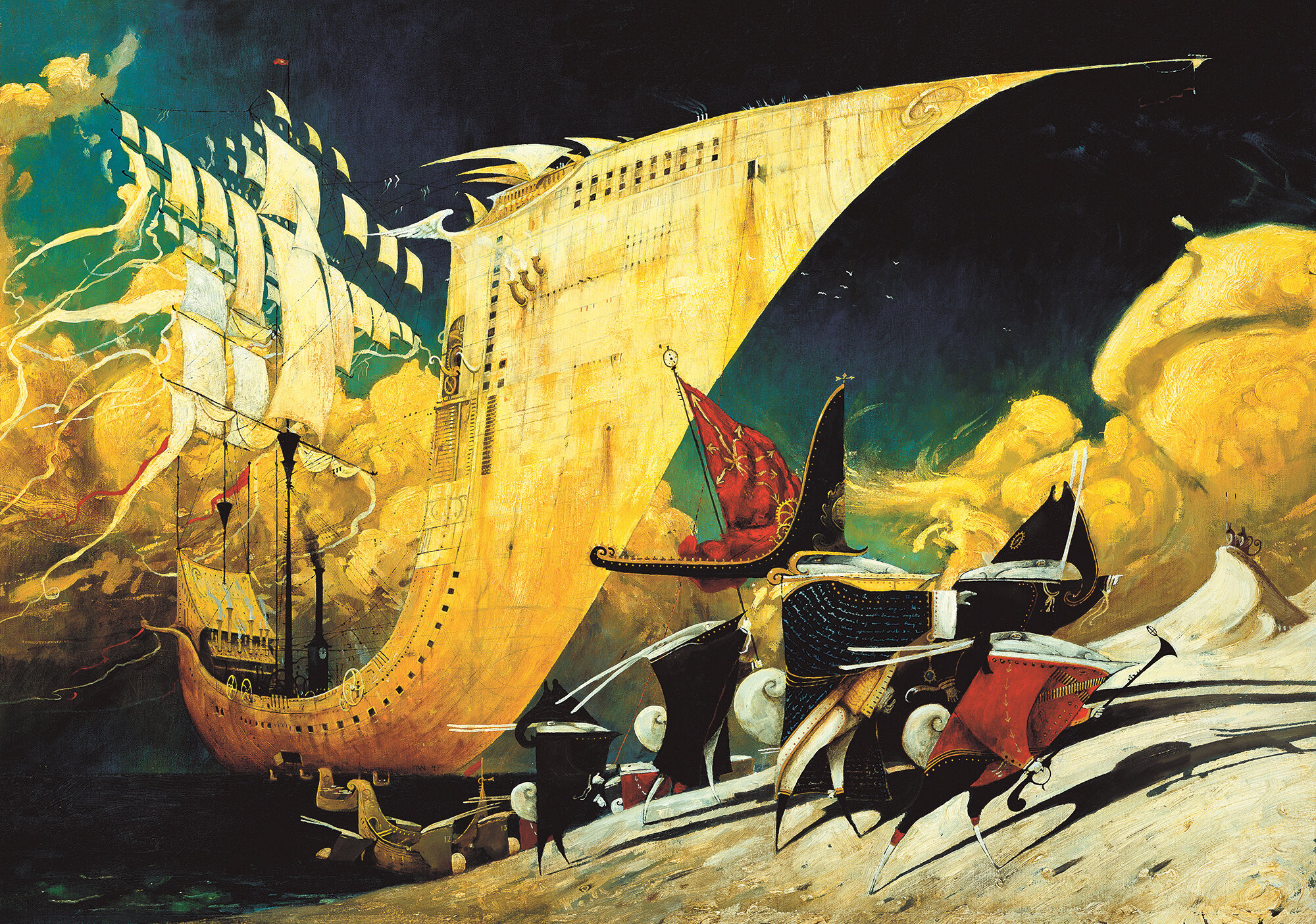
They came by water, 1997, oil on canvas, 80 x 50cm
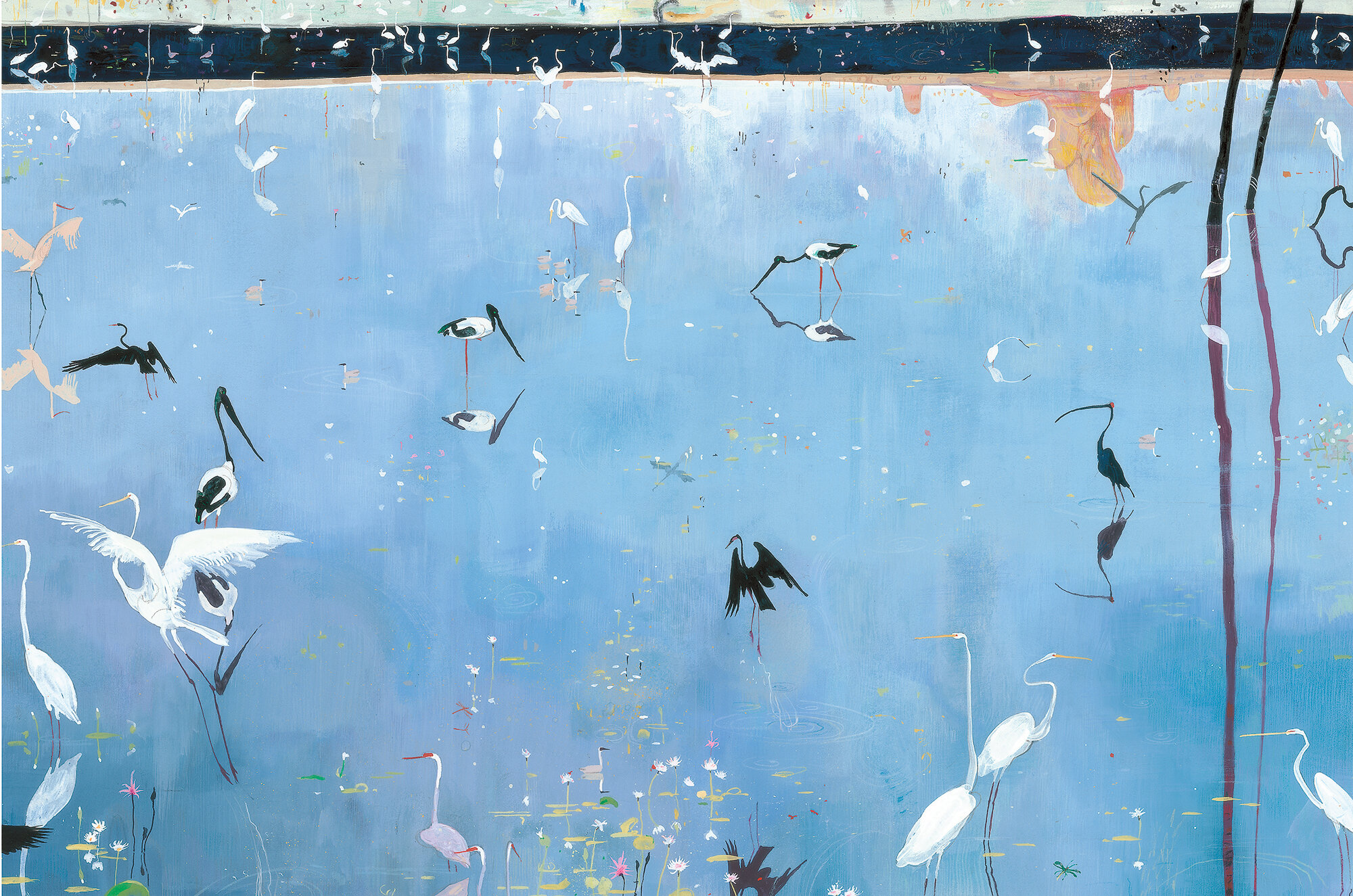
Water, 1997, acrylic, gouache and coloured pencil, 60 x 40cm
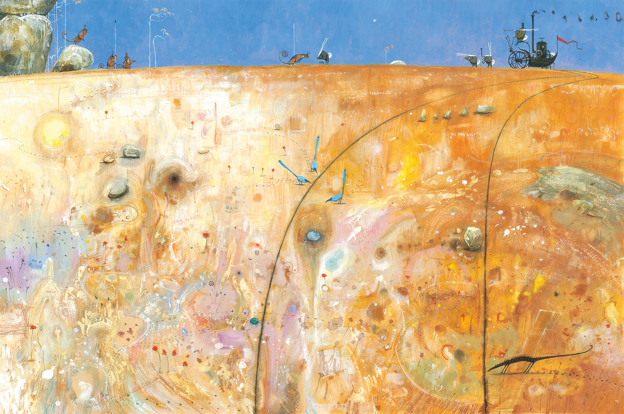
Meeting, 1997, acrylic, gouache and coloured pencil, 60 x 40cm
Rabbit houses, 1997, acrylic, gouache and coloured pencil, 60 x 40cm
Stolen children, 1997, acrylic, gouache, ink and coloured pencil, 60 x 40cm
Wall, 1997, acrylic, gouache and coloured pencil, 60 x 40cm
They ate our grass, 1997, acrylic, gouache and coloured pencil, 60 x 40cm
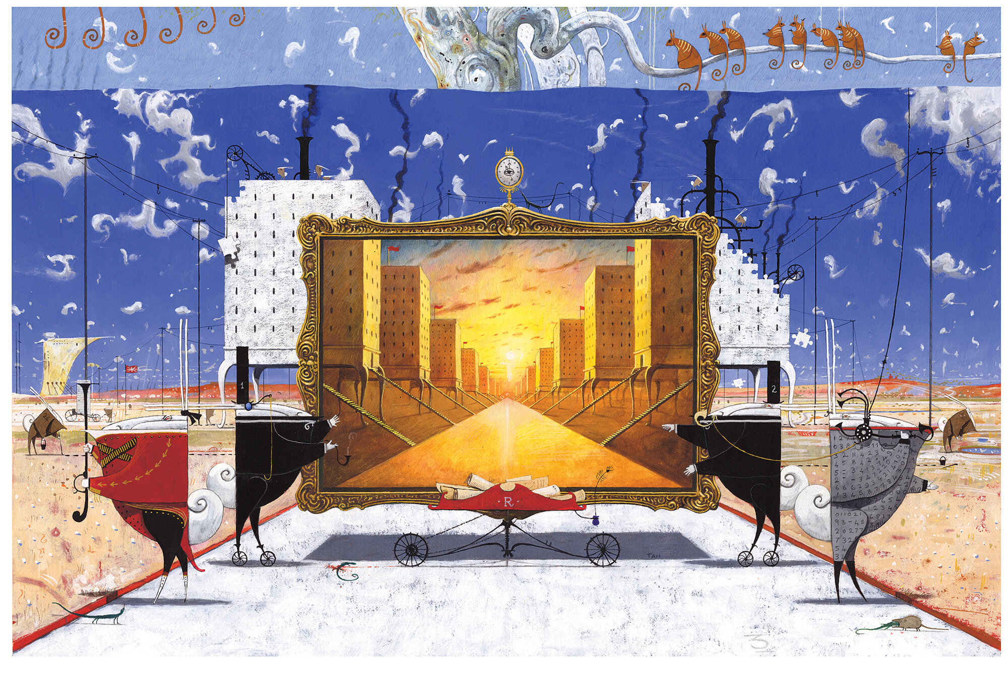
Manifest destiny, 1997, acrylic, gouache, ink, collage and coloured pencil, 30 x 40cm
The Rabbits, written by Australian author John Marsden, is a fable about colonisation, told from the viewpoint of the colonised. An unseen narrator describes the coming of ‘rabbits’ in the most minimal detail, an encounter that is at first friendly and curious, but later darkens as it becomes apparent that the visitors are invaders. The style of the book is deliberately sparse and strange, with both text and image conveying an overall sense of bewilderment and anxiety as native numbat-like creatures witness environmental devastation under the wheels of a strange new culture.
The parallels with a real history of colonisation in Australia and around the world are obvious, and based on detailed research, in spite of the overt surrealism of the imagery and the absence of direct references. It was named Picture Book of the Year by the Children’s Book Council of Australia in 2000, which generated some controversy due to its confronting themes, and was attacked on several occasions for being ‘politically correct propaganda’ by right wing conservatives. In spite of this (and even a little because of it), the book went on to win numerous awards in Australia, the US and UK, and is studied widely in secondary schools. It has been translated into multiple languages, adapted as an acclaimed opera by Opera Australia and Barking Gecko. Some of my concepts and designs inspired a section of the opening ceremony of the 2000 Sydney Olympics. Following translation into Spanish, the Mexican government made 30,000 copies of Los Conejos available free to schools in Mexico, a fascinating example of cross-cultural interpretation, given the pattern of colonial invasion and its detrimental effect on indigenous culture is universal: broken treaties, epidemics, war, stolen children, disenfranchisement and, sometimes, apology and reconciliation.
*
RABBITING ON: A Conversation about The Rabbits
The following interview was originally published in Eidolon magazine in 1999, shortly after publication of the book. The interviewer is Nick Stathopoulos, a long-time friend and fellow artist and illustrator based in Sydney. At the time I was 24, a relatively unknown, barely employed illustrator, although familiar to Australian science fiction readers due to work in small press magazines. Also a mostly pre-digital time, hence reference to fax machines!
THE RABBITS represents a watershed in your work. It also represents a massive commitment of time, effort, and dedication well beyond any financial remuneration. What attracted you to the project - it couldn't have been the money!
You got that right - I'm too scared to calculate how much I make an hour on these things! I guess Rabbits offered the potential for some really sustained inventiveness, more so than any other commissioned work I've so far encountered. There was a lot of creative freedom, with both editor (Helen Chamberlin) and author pretty much handing me a license to do whatever I wanted. The only constraint was this very simple text with a minimum of descriptive content, much less anything visual; 'The rabbits came many grandparents ago, they made their own houses, they ate our grass' and so on. Enormous potential to construct an entire universe from first principles, both conceptually and visually.
The subject of colonisation has itself also fascinated me for some time, not simply as a political issue, but as an event of utter aesthetic strangeness where two very different worlds collide. And I’m very interested in the way normal things can also be seen as abnormal. Thinking about a particular historical subject is one such point of departure, the past being a strange place open to interpretation, which affects how you see the present.
What kind of time frame was involved from manuscript to final delivery of artwork?
Probably about seven months (off and on), with more than half that time spent thinking, drawing, reading and just looking around with the book in mind. The volume of notes and sketches far outweighs that of the final artwork, which is itself just the final expression of that whole evolutionary process. It's a long time in retrospect, albeit not unusual for picture book illustrators, but I don't think about it much when I'm actually doing it. It takes as long as it takes.
Do you have to become obsessed before you can make it your own?
I don't really think about making things 'my own'. If anything, a particular idea or feeling owns me, which I guess answers the obsession thing. I often refer to Paul Klee's metaphor of the artist as a tree, drawing stuff up through the roots to slowly process into leaves. The work dictates itself towards some sort of independence from my own contrivances - hopefully anyway. When things are really working, it's a bit like dreaming, you're part creator, part spectator, and a kind of slave until everything resolves itself. It doesn't take much to get 'obsessed' when the opportunity arises, and for a while I was working on the book to the exclusion of all else. It's a bit pathological sometimes!
To what extent was John involved, and was there any true collaboration, or were you just handed the manuscript?
The latter. There was no real collaboration, as John would be the first to admit – he prefers to leave the illustrator alone, and confesses to conceiving things primarily in words, not pictures, which might go some way towards explaining his vocation as an acclaimed novelist. I didn't actually speak to him at all until I visited him in Melbourne some time after completing the book, save a couple of brief faxes.
How do you find the collaborative process?
I guess it depends on your collaborator! Personally, I've found it stimulating in the sense that I'm forced to go in directions you otherwise wouldn't (Newton's first law comes to mind - about inertia.) It presents foreign problems which need to be resolved in ways that are hard to preconceive, so there's a healthy cross-fertilisation going on. In some ways, it can help break the circuit of my own creative comfort zone, introducing a challenging resistance in much the same way that the physical limitations of media do, or objective reality for that matter. It's all about problem solving after all - otherwise it's just stylistic pretension.
All work is somewhat collaborative, so more broadly, there's also the marketing side of things you have to make certain concessions to, as well as audience. The quality of reproduction, another aspect of ‘collaboration’, is always imperfect to varying degrees when it comes to artwork (unlike text), which can mitigate one's enthusiasm for the final product, especially if you're a perfectionist.
I've always felt that illustrating text is symbiotic - each needing the other for meaning and context. When they are perfectly mated, you get something more...a synergy. THE RABBITS is a perfect example of this. Is this something that you consciously hoped to achieve, or is it serendipity?
Both of those, but more often something in between - intuition? – feeling around for what you somehow know to be there. I do have a conscious strategy to illustrate tangentially, doing something quite removed from what the text is doing without losing the reference, so the mental circuit for the reader is quite convoluted, and therefore exciting. For example, the line "They ate our grass" is associated with giant industrial fish-head machines stripping the landscape. The reader can't make the connection through the most obvious word-picture recognition (ie. bunnies eating grass), but have to go off-course a bit, which hopefully fires off some otherwise dormant neurons. Then you get a certain strange chemistry between words and pictures, an interesting tension which the word 'illustration' doesn't adequately define.
Rabbits have long been the subjects of allegory and myth - from the earliest fables by Aesop, to Bugs Bunny more recently - a mythic resonance that would not have been missed by Marsden. And although it's one thing to write about rabbits, depicting them in a way that works in context with Marsden's simple but ironic text creates a real problem for you. It would have been easy to just go the WATERSHIP DOWN route, but your art owes more to the stylized "YELLOW SUBMARINE" psychedelia of Heinz Edelmann than the watercoloury realism of Beatrix Potter. What led you to this approach? What steps did you take in developing the distinctive style for the project?
Firstly realising that there is no single ideal way to do anything, and try to push the boundaries of style and content as far as possible. One of my initial responses to the text was a decision to have no rabbits, if only to snap out of image of bunnies in redcoats. "Rabbits" would simply be a nickname for strange new creatures that looked a bit like rabbits. Stylistically, it was a developmental process, beginning with real things; animals, ships, weapons etc., and caricaturing them in successive drawings according to certain imported ideas. The rabbit houses, for instance, stand on furniture legs because they have no material or conceptual relationship to their new environment - they are just transplanted, like furniture. The rabbits themselves have no feet, their faces are as concealed as their intentions, and are literally two-dimensional.
Researching accounts of Aboriginal contact with Europeans offered some insight into how strange one must have looked to the other; the unbelievable scale of ships, the sheer enigma of European clothes, possessions, language, social hierarchy and behaviour. To draw in a realistic fashion with this in mind wouldn't work; what would realistic mean? The drawings needed to be more concerned with concepts than just illusion, like a sort of visual essay. I also wanted to avoid any specific cultural reference to an Aboriginal experience (an obviously charged and problematic issue), and do so by pushing Marsden's metaphorical approach even further, creating something weird enough to thwart that sort of face value 'decoding', if you know what I mean. You could say that the subject and its problems therefore dictated the necessary style to some extent, as with other books I've illustrated, which are all quite different.
Scale is important in your compositions. When the Rabbits first meet the...what are they?...Numbats?...they are tiny figures in the frame...the landscape dominates. But that slowly changes as the Rabbits become increasingly more dominant. It's subtle, but there nonetheless. What other devices (if any) did you employ that may not be immediately obvious?
Well, I hope everything is self-evident at some level, if not immediately. I was concentrating mostly on giving each illustration have its own individual resonance, each sentence being a title for a particular painting, so most devices are contained that way. There are a few continuities to stitch them together; the ominous darkening of colours in the beginning, contrasts between visual "noise" and "silence" and that sort of thing, all pretty obvious. There are some elements such as the clock, the flared pipe, the vector lines of the flag (echoes by pipe building and strip mining), the unseen 'queen rabbit', and a recurrence of optical devices, which all have implicit but clear meanings. Everything revolves around landscape, with a bigger (natural) picture containing everything the self-absorbed rabbits do in parentheses, it returns to a state of quiet repose. Most other devices can be described in terms of "pattern" in a very general sense, involving the varied repetition of "rabbit-made" and natural elements to suggest either dysfunctional power or environmental equilibrium - much simpler to show than describe!
Some of the paintings seem to owe some allegiance to traditional "fine art". For instance, some of your renderings seem to echo Fred Williams or Brett Whiteley. What artists or paintings did you draw on for inspiration?
I think I'm like most artists in being fairly omnivorous when it comes to inspiration (or influence, which sounds more accurate in that it is less spontaneous). It's not something you exactly pick and choose; the work of other artists is just one aspect of a larger jumbled catalogue of everyday experience that includes everything from interesting books to interesting telephone poles.
There would be too many influences to list exhaustively, but some things that came to mind when working on Rabbits include Ralph Steadman's whiplash drawings for "Alice" and the political cartoons of Gerald Scarfe (of Pink Floyd's "The Wall"); Heinz Edelmann’s "Yellow Submarine", as you mentioned, which I saw only recently for the first time, the work of American designer/illustrator Milton Glaser, Michael Leunig's metaphorical soul-scapes, Reg Mombassa's strangely familiar suburbs, and Terry Gilliam's use of juxtaposed realities and anachronism. Obviously surrealists such as De Chirico and Ernst enter somewhere, as with Australian artists such as Streeton, Williams, Olsen, Whiteley, Nolan, Boyd, Smart and Drysdale, whose paintings communicate in different ways with my own experience of a landscape that's both lyrical and ambiguous, and epic in proportion.
In a more focused way, I looked at a lot of nineteenth century drawings, etchings and photographs, especially about technology of the time. Also ancient Egyptian friezes - the rabbits borrow some of their rigid, two-dimensional monoculture from those. I'd also just returned from a trip to Paris where I saw an exhibition of illustrations for children, mostly by French and Italian art and design students, all about creation myths, which were surprisingly sophisticated and inventive - an inspiring demonstration of how far you can push picture book design and illustration. This probably had the biggest affect on me at the time.
Some of the images are iconic, I'm thinking of that fabulous centre spread which is an...homage?...parody?...of the painting of Cook setting foot on Australian soil, and gesturing to sailors not to fire upon the natives...(That piece is a knockout!). Are you trying to stimulate some kind of resonance in the (adult) viewer?
To some extent. A resonance at least, but not an homage or parody. I used that painting (in the National Gallery of Victoria) as a matter of convenience, as something to work around, hijacking that whole idea of staged, frozen grandeur, an entirely imagined scene, of course. The original painting was a point of departure, not really to refer back to in parody, although it doesn't hurt to read it in that trendy postmodern way I suppose, although it's a fairly closed response. Hopefully the adult viewer will recognise the peculiar visual language and feeling of nineteenth century History Painting rather than the exact origin - the colour, composition and figure group style.
On that point, I want to say that I don't regard the book so much as an allegory (ignore the blurb on the back!), in the manner of Orwell's "Animal Farm", so much as a more indirect, strange metaphor. The fact of Australia's invasion by Europeans was for me resource material in creating an entirely imaginary world, one which is parallel rather than symbolic like a political cartoon. You can read much more into something like that, not to mention than fact that it's more universal if its not strapped to particular references. Hopefully an American, Asian or European reader, adult or child, can connect without necessarily knowing anything about Australian history.
Is there a conflict trying to satisfy both an adult and a juvenile audience? Is this something you think about when you start working on a piece?
To a limited extent. I'm really just doing what I feel works the best, I don't have a particular audience in mind; I'm a bit self-indulgent in that way. As far as I'm concerned, it's just a picture book, regardless of what prejudices adults may have about that form. The idea of tailoring something to an audience actually depresses me a bit, your objective is no longer an open question. I'm not sure if there is a conflict across different audiences, but like to think that pictures can work on multiple levels, both emotionally an intellectually, so long as they are not particularly coded. The Simpsons always comes to mind on this question (although I'm, sure there are better examples) as something that works on multiple levels, with occasional references to things most viewers (including me) would miss, like famous photographs. In any case, I dread anyone saying "Oh yeah, I get it" because that's instant dismissal. I'm hoping to appeal to something a tad deeper than recognition or even comprehension – a fascination with the strangeness of things. I think kids are much more intelligent in that respect than many adults, who are burdened by of all sorts of narrow expectations. Children are not so busy looking for ‘meaning’ perhaps.
